deutsch

“Always keep to the rules unless it looks better if you don’t”


(from an old type setter’s schoolbook)


Apart from that there are rules over rules about how to use them: ligatures are beautiful things. During the summer months in 2010 I have been browsing my cases and taking pictures of these faszinating results of design. Here they are - be inspired and enjoy them!


Click on the foto to find still more of these beauties


s + z:
probably the most special
and the most discussed letter in the German alphabet

t + z

s-Ligatures

f-Ligatures

Syllables

Twins

Qu

Capitals in ligatures


Further reading (in German)


Bernd Brenner: Schrift. Setzen. Handbuch für Gestaltung. Kokawke, 1995 (ISBN 3-9802846-1-1)

Friedrich Forssman, Ralf de Jong: Detailtypographie. Nachschlagewerk für alle Fragen zu Schrift und Satz. Hermann Schmidt, Mainz, 2002. (ISBN 3-87439-568-5)


antiquarian:

Leo Davidshofer, Walter Zerbe: Satztechnik und Gestaltung. Schweizerisches Fach- und Lehrbuch für Schriftsetzer. Zweite Aufl. 1962.

Josef Käufer: Das Setzerlehrbuch. Die Grundlagen des Schriftsatzes und seiner Gestaltung. Otto Blersch Verlag, Stuttgart, 1956.

Walter Mehnert: Die Gehilfenprüfung als Schriftsetzer. Otto Blersch Verlag, Stuttgart, 1961 (1947).


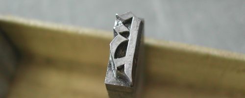
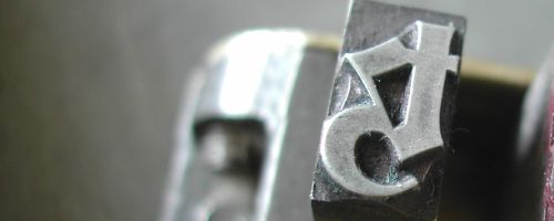
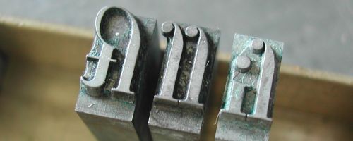
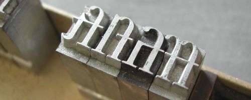
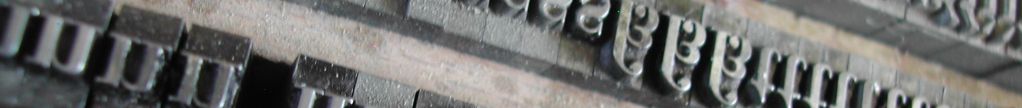
[Home] [Exhibits] [My Type] [arts joined up] [printmaking alive] [Friends&Partners] [The Video] [Book Art] [Woodcut] [Letter Press] [Metal Type] [Metal Type History] [Ligatures] [Type Designers] [Bookbinding] [Take a Look Inside] [Chronicle] [Impressum Contact] [Al-Mutanabbi-Broadsides] [Human Rights] [LittleEncyclopedia]